The Color of Pearls
by Christina Stefani for House of Stefani
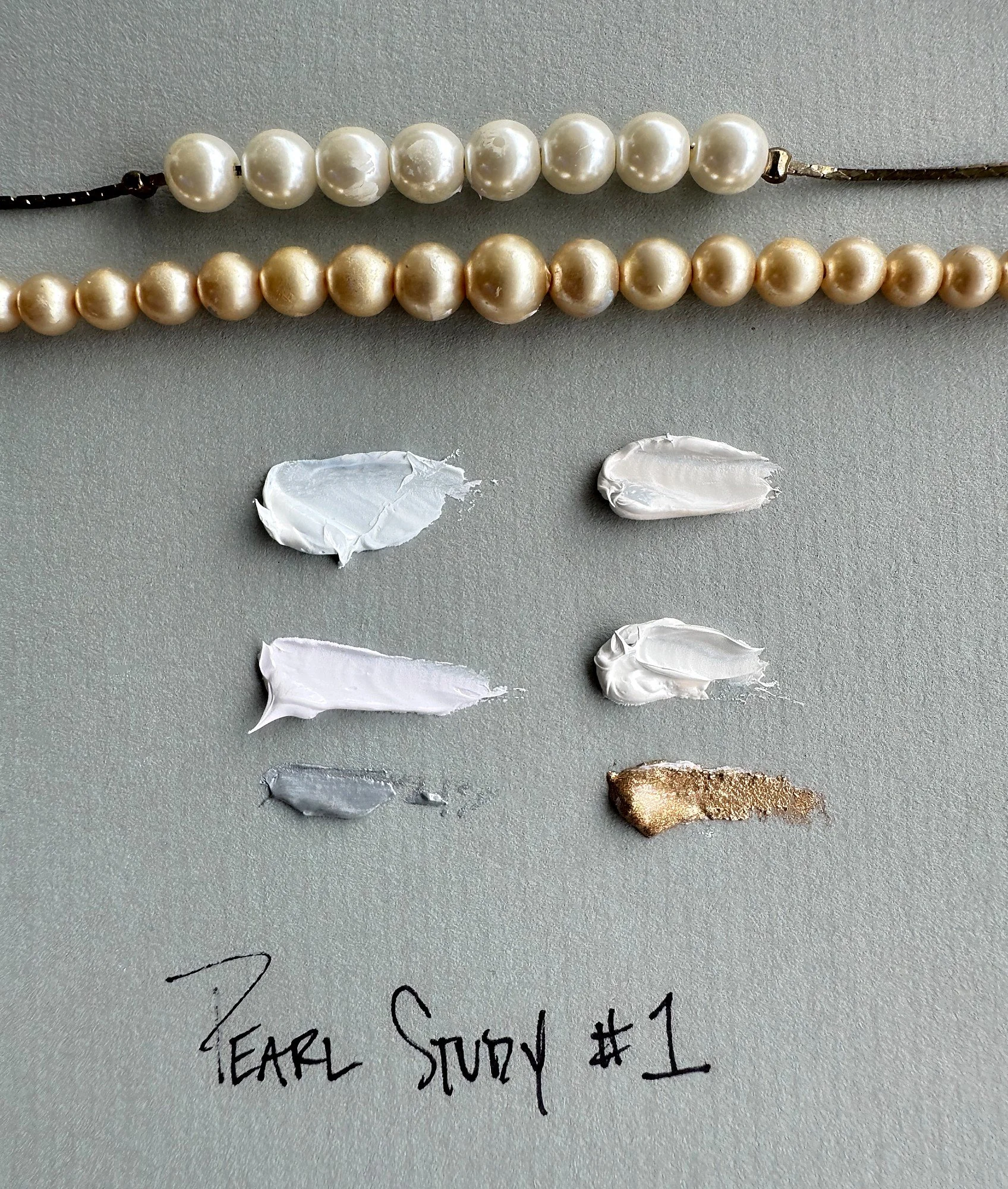
Pearl Study #1, Christina Stefani, 2026. Pearls and oil color studies for works in progress.
I have worn pearls for years.
They are almost the only jewelry I wear.
Perhaps that is why I notice their colors so carefully when I paint.
We tend to call pearls white.
But the longer I paint, the less I believe in white.
Place one pearl beside another and suddenly the differences appear.
One is warm, almost cream.
Another leans toward silver.
One carries the faintest blush of rose.
Another seems lavender in cool light.
There are pearls touched with blue, green, gold, grey.
What appeared simple from a distance becomes remarkably complex when we look closely.
That is something painting teaches us again and again.
White Is Rarely Only White
In gemology, pearl color is more complicated than a single name.
The Gemological Institute of America describes three possible components: bodycolor, the dominant color of the pearl; overtone, a translucent secondary color that appears over it; and orient, an iridescent play of colors that can seem to move across or just beneath the surface.
Not every pearl exhibits all three.
But even the familiar white pearl may contain far more color than the word white suggests.
Akoya pearls, for example, are known for white or cream bodycolors that can carry soft rose or green overtones. South Sea pearls move from white and silver into cream and gold. Freshwater pearls can appear in pink, peach, purple, and lavender.
Pearls can contain both warm and cool color families, often with the softness and restraint that make their colors difficult to name precisely.
A pearl is not simply a color.
It is color interacting with light.
Painting Pearl
I have been mixing these colors lately for a new group of paintings.
Today I laid two strands of pearls beside the mixtures I had been making for the paintings. One strand is cooler, silvery, and almost blue in places. The other carries cream, warmth, and soft gold. Beneath them, the paint mixtures begin to echo the same distinctions: pearl blue, warm cream, lavender-white, silver, gold.
Seen separately, several of those colors might simply be called white.
Seen together, they are anything but.
Warm pearl.
Cool pearl.
Silver.
Cream.
Lavender.
Touches of gold.
The differences can be extraordinarily small.
A little more warmth and a grey begins to feel luminous rather than cold.
A trace of lavender can pull a silver into atmosphere.
Cream can soften an area without making it yellow.
Gold can appear almost imperceptibly and change everything around it.
These are not dramatic colors.
Their power is in their relationships.
When I am mixing them, I sometimes find myself adjusting a color by amounts that would seem almost absurd to someone looking at the finished painting.
A touch.
Then another.
Then perhaps returning to what was there before.
But subtle color requires patience.
The eye needs time to understand what it is seeing.
Light Changes Everything
A pearl does not produce its beauty through pigment alone.
Its layers of nacre interact with light, producing the depth, reflection, overtone, and sometimes the iridescent effect known as orient. The result changes as the pearl moves and as the light around it changes.
That feels familiar to a painter.
A color mixed on the palette does not exist independently.
Put it beside blue and it changes.
Place it against cream and it changes again.
Surround it with gold.
Move it from daylight into evening light.
Glaze another color over it.
Every relationship alters what we perceive.
This is one reason I work in layers.
A luminous surface is rarely created by choosing the correct color once.
It develops.
One passage influences the next.
Something beneath remains partially visible.
Light passes through one layer and meets another.
The finished color contains its history.
Warm Pearls, Cool Pearls
I have become particularly interested in the difference between warm and cool pearls.
A warm pearl might move toward cream, champagne, rose, or soft gold.
A cool pearl might carry silver, blue, grey, green, or lavender.
Neither is more beautiful.
They simply create different feelings.
Warm pearls can feel intimate.
Cool pearls can feel atmospheric.
One seems touched by candlelight.
Another by sky.
And then there are pearls that refuse to settle completely into either category.
Those may be the most interesting of all.
They change.
The Beauty of Subtlety
We live in a visual culture that often rewards immediate impact.
Strong contrast.
Saturated color.
Something recognizable in an instant.
Pearls ask for something different.
Their beauty can be quiet.
You have to come closer.
You have to notice.
A strand that appears uniformly white from across a room may contain extraordinary variation when held in the hand.
Perhaps that is part of why I have always loved them.
They do not need to announce themselves.
Their beauty is discovered through attention.
Layers
There is another quality of pearls that has been on my mind.
They are built gradually.
Nacre accumulates in layers around a nucleus or implanted tissue in cultured pearls. Those layers eventually become part of what gives the pearl its surface, depth, and luster.
Painting can work that way too.
Especially glazing.
One transparent passage may seem insignificant.
Then another.
Then another.
Eventually light begins behaving differently.
The surface acquires depth that could not have been produced by a single opaque mixture.
Some things become what they are through accumulation.
A pearl.
A painting.
A friendship.
A body of work.
Perhaps even a life.
Learning to See More
When I began painting, I might have called a passage white.
Now I see pearl.
Warm pearl.
Cool pearl.
Silver touched with lavender.
Cream carrying the faintest gold.
The object has not necessarily become more complicated.
I have simply learned to see more of what was already there.
That may be one of the great gifts of making anything seriously.
Practice changes perception.
We begin by learning how to make.
Eventually, if we are paying attention, making teaches us how to see.
I have worn pearls for years.
But painting them taught me how many colors they contain.
And perhaps that is why I continue returning to both.
Neither reveals everything at once.